Wednesday 1st May 2024
NEA Introduction
LO: To explore coursework briefs and requirements.
What is the NEA?
- The NEA (non-examined assessment) is a mandatory piece of creative work that forms 30% of your GCSE in media studies.
- You will produce a single creative production in response to a brief set by EDUQAS.
- You will need to stay organised and stay focused in lesson in order to meet deadlines.
How is the NEA marked?
The total number of marks available is 60:
- 10 marks for the statement of aims.
- 20 marks for creating a media product that meets the requirements of the set brief.
- 30 marks for creating a media product which uses media language to communicate meanings and construct representations.
Candidates who do not use original footage, images or text for the production must not be awarded marks above band 2 for the production.
My brief - I would like to do the film marketing for horror.
Friday 3rd May 2024
NEA research
LO: To research the codes and conventions of similar products.
Do Now:
I would like to think of about five different horror movie titles which sound appealing.
- Psych ward: follow the story of a patient who has been sent to the psychology ward and is taken care of by a certain nurse. It isn't always her, but she always feels anxious when it is this nurse that has been taken care of her. She always feels faint and hazy, and almost always has some sort of blood dripping off her arm. One day, there is a commotion out in the hall, and the electricity shuts off. She is then dragged into a constant battle of hide and seek, running from the nurse as she slowly works her way through killing her patients, with no specific method: she uses the reasons they are sent to the psych ward to kill them. Will the patient survive? Or will she perish at the hands of the nurse, who should have been locked up with her?
- They can hear you: In a dystopian world the government has installed microphones everywhere. The main character gets caught saying something bad, and is taken to a room they call the slaughterhouse.
Tagline: This will kill you
Research Task 1:
Film 1:
Main Theatrical Poster:
- The main image is a little girl staring at the television screen, who i presume is the main character. She is represented as creepy and as if she's drawn in by something even though the screen consists of static. I'm not entirely sure but i think a long shot is used to show how her hands are placed and to show how she is more drawn to the screen than to her toy which we can see on the floor.
- It is laid out with the title is below the main image in the centre, and the tagline is just beneath that. There is also a credit block along with the production company beneath that.
- The universal logo is included at the bottom of the poster, in the right hand corner underneath the credit block. The age rating is not included on the poster.
- The title is at the bottom in the centre below the main image to ensure you can see both. The font is in capital letters and in clear bubble writing which showcases the dark blue (it's actually black but my poster is bad quality) background of the poster.
- The other information included is: the credit block and the tagline are on the poster. The universal logo and it looks like another production company is also mentioned just below the tagline.
- The colour palette: there is a dim blue tint on the carpet and the girl, which have connotations of not only sadness, but also fear, which the dimness contributes to to create an overall eerie effect and make the viewer feel uncomfortable, but also question what's going to happen. The TV screen is white and black, suggesting it is broken which adds to the overall scary effect of the poster. The white by itself would have connotations of purity and the black of death, so when they join together it has connotations of perhaps a ghost or an angel, but considering the overall effect this poster creates, i would argue the former is probably more accurate.
- Different fonts used: the title has bubble writing which makes it easily visible while the tagline is smaller and uses an italic font, to make the title stand out more.
DVD Front Cover:
- The main image is a little girl staring at the television screen, who i presume is the main character. She is represented as creepy and as if she's drawn in by something even though the screen consists of static. I'm not entirely sure but i think a long shot is used to show how her hands are placed and to show how she is more drawn to the screen than to her toy which we can see on the floor.
- The title is positioned at the top of the poster, and a sans serif bubble writing font is used to make it stand out. The writing has rays of light coming out of it, which foreshadows the plot of the movie, when the poltergeist comes out of the TV.
- A tagline is included, which says, "They're here." It doesn't give away much about the film which gives the film a sense of mystery, however the quotation marks imply that this is a line in the film, and that the film will involve ghosts infiltrating a house.
- The colour palette: there is a dim blue tint on the carpet and the girl, which have connotations of not only sadness, but also fear, which the dimness contributes to to create an overall eerie effect and make the viewer feel uncomfortable, but also question what's going to happen. The TV screen is white and black, suggesting it is broken which adds to the overall scary effect of the poster. The white by itself would have connotations of purity and the black of death, so when they join together it has connotations of perhaps a ghost or an angel, but considering the overall effect this poster creates, i would argue the former is probably more accurate. The tagline is also white, which could represent the ghost.
- The only other information given is the production company, Metro-Goldwyn-Mayer, which was the same production company that did NTTD showing that this movie might have a lot of money to work with for the production and editing, which will add to the atmosphere of the film.
- The title uses a sans serif bubble writing font which is used to make it stand out. The writing has rays of light coming out of it, which foreshadows the plot of the movie, when the poltergeist comes out of the TV. The tagline is significantly smaller than the title and is written in italics, which contrasts the large title and makes it stand out.
- The genre is shown through the colour palette which has connotations of an eerie, scary horror place. The main image also contributes to this as the static on the TV implies that there is no internet connection, and therefore no way to call for help. Also, the way the girl is drawn in to the TV it gives the impression that she is hypnotised by this seemingly unnatural "other world".
DVD Back Cover:
- There is not a main image, but there are many snapshots of different moments in the film.
- There are ten thumbnails, and they all show different moments of the film. These include the top image which links to the front cover and shows that this will be an important aspect of the film. This girl is clearly the main character, and the TV clearly has significance as well. The top left one would also be very appealing to the audience, as it clearly shows a high action shot, and it makes the audience ask questions about the film and why the house is like this. It clearly depicts the climax of the film, and has associations with the paranormal.
- The images suggest that this film is a movie filled with different twists and turns, and it is unpredictable. This can be seen because the action thumbnails are interspersed with regular family ones, implying that the story is going to ruin the family's lives. The static on the TV emphasises this as it implies the family have no internet, and this could show that they either lost it when the bad things began to happen, or they never had it to begin with. Also, the colour palette has connotations of the supernatural, which shows the film will centre around ghosts.
- Enigmas are used to entice the audience as one of the thumbnails (the one with the house and the light: top left) doesn't have any explanation alongside it, it is alone, and this creates a series of questions running through the audience's heads, and makes them want to watch the film to gain answers. The static on the TV also provides a sense of mystery, as it forces the audience to consider why they lost the picture.
- The blurb gives us a brief overview on the film, including how the story started and then how it got darker. It communicates the genre of the film through a very short sentence after a whimsical and happy one: "Then things turn darker." This sentence is very effective because it gives a sudden almost jolt of information which displays the genre by itself, but the sentence itself also has connotations of horror. This is then followed by a basic outline of the story after things turned darker, and talks about the family's fight to get their (I presume) daughter back from the "spectral void."
- The whole cover is covered in black, apart from the snapshots that add a pop of colour, but even those have a very dark colour palette. This connotes an eerie environment, and emphasises the theme of horror because black is a typical colour used in horror films.
- It includes a barcode and blurb, both of which are placed towards the top of the cover, and the purpose of the blurb is to give information about the film, and the barcode is to buy it. It also includes a special features section towards the bottom of the cover, which provides even more information to the viewer. There is then a credit block filled with credits for those who worked on the film and some logos in the bottom corner of the cover, with the production company, age rating and running time. Finally, there is some information on the soundtrack and subtitles and which languages they come in.
- There are not many different fonts used, with the sans serif font being the most common one, which ties the whole cover together nicely. The credit block has a slightly different font, making it stand out and giving it the same typical look you would find on most DVD cases.
- there are many different people on the cover, and they are mostly represented as either scared, shocked on intrigued as to what is going on in front of them. This is very stereotypical for a horror movie as the whole purpose of them is to scare the audience, and part of this is seeing others scared which forces you to reflect the emotions on the character's faces.
Film 2:
Main Theatrical Poster:
- The main image is a young child with his back to the camera looking up at a single red balloon with an evil-looking clown holding it, giving it to the child. A long shot is used, and the child is represented as innocent and happy, as he is wearing a yellow coat, and this colour has connotations of both of these things. The red balloon is singular, which gives a very sinister feeling as most of the time a balloon would be in a big bunch of them if the impression you were supposed to get was happiness, so a singular one has the opposite effect. The clown, because it is faded is represented as incredibly sinister and evil, and like its not supposed to be there.
- The title is positioned in the centre of the poster to the right of the image, with the release date of the film directly underneath it. This allows you to tie in the red balloon with the red title and to survey the poster as a whole, without the title feeling separate from the image. The tagline is positioned above the title, which is strange for a movie poster.
- It is a very simplistic design, so no logos are included on the poster.
- The title is in the centre of the poster to the right of the main image and a very shaky sans serif font is used, which adds to the genre of the movie because it implies that the person was/is shaking in fear. Also, it is very unconventional for a title to be placed in the centre of a movie poster.
- The tagline is placed above the title, which is very unconventional for a movie poster. The release date is also on the poster, which is positioned below the title.
- The colour palette used is red and black, with a touch of yellow. The yellow contrasts the red and black, as they both have very negative connotations of danger and death, whereas yellow has connotations of happiness and innocence. This juxtaposition creates an unsettling feeling because it is a mix of two very different emotions.
- The same font is used throughout the whole poster (sans serif) which gives the sense that it is very tied together. Different sizes are used however to make the title stand out, and the release date is slightly more faded to ensure the tagline, title and main image are all the main focus of the poster.
DVD Front Cover:
- The main image is the same one as on the poster, but with the clown slightly more illuminated, which only adds to the fear this cover instills. The fact that the clown is a lot larger than the young boy emphasises the boy's innocence, because he is clearly being confronted by someone not only far more terrifying, but also older and bigger. Again, a long shot is used.
- The title is in the lower right corner of the cover, and a sans serif font is used. This is the same font as on the poster, so this could have been a deliberate choice to ensure all elements of the marketing could be linked together. The sans serif font is written shakily again, which gives the sense that the person writing it and the clown are both unstable, as the red in the title links to the clowns face and the balloon it is holding.
- There is a tagline that reads, 'your fears are unleashed', which creates a sense of apprehension without revealing anything about the film. It only gives a small sense of how scary the film is going to be, and is still able to keep the plot a secret, which is typical for horror movies as if you knew too much about the plot, it would ruin the fear element of the film, and any jump scares wouldn't be effective.
- The same colour palette is used as on the poster, only here, there is the addition of white, which would usually have connotations of purity, but because it is paired with the red, it instead gives the impression that the clown is ill, only not necessarily physically, more mentally. The innocence that the yellow gives is even more emphasised here because of this.
- There is a line at the top of the cover that reads, 'based on the best terrifying novel' and it says just above the title, 'Stephen King's' which just tells you that the poster is based on the book he wrote. It provides some context to the buyer.
- Again, a sans serif font is used throughout the entirety of the cover, which again just ties it all together nicely. The only difference is the sizes: the title is the largest, followed by the tagline and the line st the top, and finally the author of the novel. This allows you to instantly read the title and the tagline, so you immediately get a feel for the genre and storyline of the film. This also allows you to focus on the main image more than the writing, as there isn't too much and the image is larger.
- The genre is shown through the colour palette, which comes together to create an unsettling feeling as you wouldn't know which emotion to feel, however fear mainly dominates, as the majority of the poster consists of red, black and deathly white. The fact that the young boy is so much smaller than the clown contributes to this, as it gives a prey vs predator dynamic. The fact that the clown is looking downwards also adds to this dynamic, as the look in his eyes looks like the kind a predator would give prey before it eats it.
DVD Back Cover:
- The main image consists of the same evil-looking clown from the front cover, and there are two pictures of him from different angles. The first picture at the top has a medium long shot and is shot from the front, whereas the second one which is slightly lower uses a mid shot and it is taken from the side, as we can see the clown (Pennywise) sat down holding a red balloon. He is represented as pure evil, and we can see this from the angle he is looking at. He is also represented as intelligent (in an evil way) and cunning, as he knows to stay in the shadows if he doesn't want to get caught. It also presents him as slippery, because you can't catch a shadow, so it suggests he is untraceable.
- two thumbnails are used, and in the first of these we see our first full shot of Pennywise in a good light so we can fully take in how terrifying he is. It also allows us to sympathise with the young boy on the front (Georgie), as if thats scary for an older audience, it must be horrifying for a young child. The second shows a sewer pipe, which gives the audience a hint as to where the clown lives or where he takes his prey, as we can see the clown's face in the pipe.
- The images suggest that this will be a very dark story, not only due to the colouring, but also just the general nature of the pictures give this impression because of Pennywise's facial expression, and sewage pipes are thought of as run down, which also gives this impression because run down, disgusting places are typical for horror movies.
- One enigma is created with the sewage pipe, as all we see is the clown, so it begs the question what else is in there? Another one is with the first thumbnail, as it makes the audience question what he's looking at. Also the fact that the clown is presented as evil makes the audience ask questions, as typically clowns are happy and nice and are at children's birthday parties, to make them happy. The fact that the clown is in shadow also makes the audience question who he's hiding from.
- The blurb gives a brief outline of the film without giving away too much. It names the killer clown and confirms the audience's suspicion that he is evil. It communicates the genre of the film as it talks about how children are disappearing (which is horrifying and a nightmare for every parent so it communicates fear correctly) and how the neighbourhood is banding together to fight Pennywise, which is a typical convention of a horror movie, as they usually push a lot of people who don't know each other well, and this is exactly what is happening here.
- The colour palette used is red and black. The red and black both have very negative connotations of danger and death, which creates a dark feeling because these are very dark things. There is also the addition of white, which would usually have connotations of purity, but because it is paired with the red, it instead gives the impression that the clown is ill, only not necessarily physically, more mentally.
- the other information shown is a credit block (which gives credit to anyone who worked on the movie) and a comment complimenting the film that says, "gives the original a run for its money" which tells the audience that it is going to be a brilliant movie, as the original was a good film, so if this one is better, then it is worth watching.
- A sans serif font is used all over the cover, front and back, and the only real difference is the colour and the size. One of the sections of the writing is red, which links to the colours Pennywise wears and indicates that he says this line in the film. It sounds like a horrifying line as well which would tie into his general demeanour and look. The blurb is a lot smaller than the quote from the (I presume) movie critic which could imply that they want this more prominent because it compliments their film.
- The only person featured is the clown, who is represented as horrifying and someone you would want to stay away from. He also seems like he targets children as he is holding a balloon, something children are typically attracted to.
Overall:
- The genre conventions featured for a horror movie conventions on these posters and DVD covers are: a dark colour palette (this is featured on both and is typical as this creates an eerie feeling), secluded locations (the sewer pipe and the farm house in the middle of nowhere), there is a family featured on the Poltergeist DVD cover, there are young children on the DVD cover and poster of both the films, and ghosts and spirits are connoted on the Poltergeist DVD and poster.
- One of the ideologies presented is family. We can see this on the DVD back cover of Poltergeist where on several of the thumbnails there is the whole (what i assume to be family) together in many of them, and they are all protecting each other, something that could potentially also be considered an ideology as they are helping each other.
- The people are represented as hypnotised, (the little girl is staring intensely at the screen, giving an uncomfortable feeling to the audience on the Poltergeist cover and poster) scared and horrified (the people on the thumbnails on the back of the DVD cover, and an audience seeing this would begin to feel scared themselves, especially considering they don't know what it is scaring the characters on the Poltergeist movie cover). The places are all represented as eerie and somewhere you wouldn't want to be, even the home. This is because of the dark colour palette and lack of furniture, which both come together to form this impression. Even the room depicted that has a light turned on also gives an unsettling feeling. This is because the people aren't comfortable in the room, and the ladder in the corner looks like it has fallen, potentially in a fight or just in a commotion. On the IT DVD cover and poster people are represented as prey and predators. The prey is the young boy, and we get this impression from his yellow coat, which makes him appear innocent, and the predator is the clown, who is above the young boy and eying him up like a predator would a meal.
- The target audience specifically is those who enjoy thrills and the sense of fear. The poster and DVD cover would both appeal to a person like this because it clearly depicts that there are several action filled scenes. The girl on the front along with the static on the TV gives an eerie and scary feeling to the viewer and the thumbnails all clearly depict many action shots, including pictures of those who are scared which would appeal to someone who enjoys this sense because they would see others feeling the same way and want to watch the movie for the Poltergeist poster and DVD cover. For the IT poster and DVD cover, the target audience would be anyone aged 15 or over, as that is the age rating for it, so it is specifically designed to create enjoyment for these ages. Also, anyone who enjoyed killer clown movies would enjoy this as well, as this is the whole premise of the movie.
Wednesday 8th May 2024
NEA Research
LO:
Do Now:
1) A tagline, a colour palette usually consisting of red, black and generally dark colours and the production company logo.
2) Women are weak and cannot protect themselves (this is not featured in all films but it is in a lot of them).
Friday 10th May 2024
NEA Research
LO: To research genre codes and conventions.
Do Now:
1) I am planning to do a horror movie poster and DVD cover.
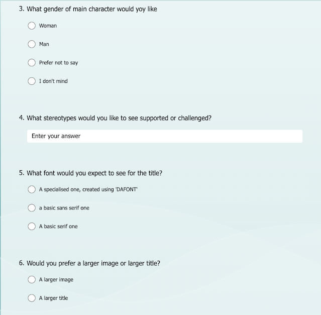
2) Through the tagline and the main image.
3) I am intending to challenge the stereotype that women are weak and (POTENTIALLY) couldn't possibly be killers in horror movies.
Wednesday 15th May 2024
NEA Research
LO: To research the representations created in similar products.
Do Now:
Representation is how someone is presented in a magazine, film or photograph. It is how you perceive them based on how they are stood, what clothes they are wearing and their facial expression.
Representation is how media texts deals with and presents gender, age, ethnicity, national and regional identity, social issues and events to audiences. this can be done through shot type or angle, mise-en-scene or editing.
Research Task 2:
imagery:
Horror movies often use images in their posters and DVD covers to deliberately frighten their audiences, as they want to appeal to those who would enjoy that thrill of fear. These images often include young children, especially if they look hypnotised, as this is usually more terrifying than an adult being hypnotised, potentially because we think of children as pure and innocent, so when they are forced to do something awful, it feels worse for the audience. Another thing often featured on the posters and DVD covers is monsters hiding in the shadows (for example, on the 'IT' poster, Pennywise is hiding in the shadows so Georgie can't see him), and this provokes fear because we don't know when it's going to pounce and on who, it gives the feeling of a predator surveying their prey.
Typically, horror movie poster main images and DVD front covers have an either identical or similar main image, potentially to tie them together and so fans don't get confused when purchasing DVDs. Both are usually very simplistic as well, with barely any text, which helps the audience to focus on the main image and get the 'fear thrill' they are seeking when they watch the film. While the front of the DVD cover is normally relatively simple, the back is far more detailed, usually with multiple thumbnails and big blocks of information, credits and logos such as production companies and age ratings.
Colour palette:
Horror movies almost always use a dark colour palette. This typically consists of black, which has connotations of death and gothic horror, which are typical themes throughout most horror movies. They also often use the colour red, which in this context has connotations of blood and danger (on the IT poster, he has a lot of red on his costume and face, which connotes that he has killed people before, and that he is a clown, because his makeup looks as if he's come from the circus), which is often the main premise of a horror movie. White is sometimes featured on horror movie posters, however it typically means ghosts will be a part of the film (for example, Poltergeist has a lot of white on the cover. IT also has some white, but it is paired with red, so it connotes that Pennywise is ill, and maybe not just physically). Any other colours that are featured on a horror movie poster or DVD cover usually have a dark tint over them, so it looks like grime.
Typography:
Horror movies typically use a sans serif font, which is very simplistic, so it not only allows the audience to focus on the main image, but it also adds to the overall simple design of the DVD covers and posters. However the titles of horror movies almost always use a special variation of sans serif to make them stand out. For example, on the IT poster and DVD cover the title has very shaky look, which is very interesting, as it suggests that not only Pennywise is unstable, perhaps the writer of the title is shaking out of fear of the film, suggesting how scary it is, making it appealing to audiences. Another example of this is the Poltergeist poster and DVD cover where the title has bright white rays coming out of it, suggesting the film includes ghosts and the supernatural and it again is more unusual than most movie posters, which makes the title stick out more than it would on a regular movie cover. Often, the title connotes what is going to happen in the film.
Characters - typical character types and styles:
There are many typical characters in horror films, such as:
- The nerd. This person usually annoys the other people they are thrown together with until it gets to a crucial moment and the useless facts they have been spouting out all night finally becomes useful. They usually end up saving the group right when it looks like there's no hope of return.
- The popular girl. This person usually is clueless, refuses to talk to anyone and at first is very naïve, and very particular about herself, refusing to do simple tasks because she might get dirty or break a nail. Later in the story, there is normally something interesting revealed about her, like she has a special talent that will help them escape. She then starts to talk to everyone more openly and is usually far more intelligent than what meets the eye. She helps people to escape and ultimately becomes friends with everyone.
- The goth. This character is usually fed up with everyone and hates the popular girl because of how pathetic she acts at the start. This person usually has some sort of knowledge about technology and this usually helps the person.
- The villain. The villain varies massively in horror movies, ranging from evil ghosts to killer clowns to serial killers and they usually have no remorse, no morals and no empathy. They are ruthless and ignore any emotions the person they are about to hurt/kill, and often laugh at them. They usually eventually get their consequences, even if there is a sequel to the film, there is usually a new villain, or the original villain is able to drag themselves out of their death/consequence.
- Young children. There is usually at least one young child, who either needs rescuing or is an essential part of the team, and has a surprising amount of knowledge for how young they are.
- The side characters (families of victims). These people are usually only featured in a very small part of the film, as a side clip of them talking to the police or worrying about the victims. Sometimes, the villain is also a family member, even if it is a side villain. They usually have very stereotypical emotions, like relief, fear, and panic.
- The police. The police are usually depicted as clueless, and useless. They never do anything to help, and one of their classic lines is, "I'm sorry ma'am/sir there's nothing we can do."
Narrative - typical sort of storylines:
There are many typical storylines in horror films, such as:
- A group of complete opposites are thrown together with a mutual need to survive. Usually they are all being hunted by one person/thing, and are locked somewhere. At the start, they all ignore each other and disagree with each other, but usually somewhere in the middle someone says they need to work together and they all band together to defeat the villain. It usually ends with them escaping, the villain dead and them hugging their family. They usually each learn a lesson in this, and have formed lifelong friends.
- A completely gory horror storyline, like in SAW, when they are basically tortured, and are forced through agonising experiences to try and survive. This film ends with the reveal who the villain is, and someone sawing off their foot to escape.
- A group of people band together to save one child or person who has gone missing and the police won't do anything.
- Some horror movies have a very manipulative storyline. For example, in the horror movie RUN, the victim's mother is giving her medication that is harming her. When she asks for help from someone, they get hurt and her mum turns into the villain she truly is.
- A paranormal storyline. Normally, an evil ghost invades a house, or possesses a body or draws a child in and takes control of them or talks to them. For example, in Poltergeist an evil ghost talks to a young girl, and seems harmless at first, but it soon becomes menacing when the young girl (Carol Ann) goes missing, and the family hires an exorcist to help. Another example would be Insidious, in which a young boy goes into a coma-like sleep, because a demon is trying to possess his body. He is lured into the further, and can't get back out again. His father goes in to save him, and succeeds, but gets possessed himself.
Representations of people - describe how they are shown stereotypically
Women - in horror movies, women are stereotypically represented as weak victims of the monster/killer. They are represented as the Disney princess of the horror world: weak, and have to be saved by a man. They are often also wearing very revealing clothes and are objectified.
Men - men are stereotypically represented as the hero or the saviour of the story. They usually kill the monster and save the damsel in distress. Stereotypically, the villain is a man, so they are often represented as menacing, merciless and ruthless. They are almost always represented as stronger than any woman in the film.
The police - the police are stereotypically represented as useless and stupid. They are featured in a lot of horror films, and almost always either don't believe the victims or say they can't do anything to help them.
The villain - they are stereotypically represented as evil, menacing and merciless. Unlike a lot of other films, the villain has no sympathy for their victims in horror films, and often even when they have lost they still laugh, showing how they can also be represented as psychotic and insane.
Do Now:
Primary research is when you gather information that has not been collected yet, secondary research is a type of research that has already been compiled, gathered, organised and published by others. Primary is when the research is obtained first hand, secondary research is when it has been obtained second hand.
Wednesday 22nd May 2024
Do Now:
What sort of colour palette would you expect to see on a Horror movie poster?
What sort of character would you want to see on the DVD cover?
What is it about the horror genre that you enjoy?
Research task 3:
Poltergeist:
Describe the representations as a whole in 3-5 adjectives.
- Fearful (they all have some sort of scared expression on their face).
- Terrorised (there is a little girl who has a terrified expression on her face).
- horrified (there is a girl looking into a hole in the ground with a horrified expression on her face).
How is gender represented? How has this been constructed?
Women are represented as terrified but also strong at the same time. We can see the fear aspect of this through the little girl in the bottom left of the montage of images, as she looks horrified at whatever is casting the light on her face. the girl above her also contributes to this, as she has clearly just uncovered something horrifying. This is a stereotypical representation of women in horror movies, as they are typically the 'damsel in distress' in horror films: they are the Disney princesses of the horror movies, and usually are saved by a man. Women are also represented as strong. We can see this in the woman next to the girl in the bottom left of the poster. She is clearly being very defiant and looks as though she could be standing up to whatever is causing her family fear, or she is trying to protect someone, by ordering them behind her, as she is pointing behind her. This is an anti-stereotypical representation of women in horror movies because (as mentioned previously) women are often depicted as weak and unable to do anything in horror films, so this is not traditional: they are not reinforcing this sexist stereotype. there is another image that backs this up: the second one up from the bottom on the right of the montage. She also looks very strong, as everyone else is behind her and she looks very defiantly towards the light that is shined on her and her family.
Men are represented as either unbothered or concerned. We can see the concerned side of this from the second image up from the bottom on the right, as the woman is clearly facing off with the monster and the man next to her (I assume her husband) has a very concerned look on his face, as he is frowning and looking at her with alarm. This is anti-stereotypical for a horror movie as they are normally represented as strong and powerful, and never scared, but this contradicts this stereotype, as the man is very concerned which is completely opposite to the typical representation of men. Men are also shown as unbothered. We can see this in the picture with the three people in at the bottom of the poster. The man to the left of the image is looking on as if the thing he is looking at is paint drying. This is stereotypical for a horror movie, as he isn't doing anything to do, so if he is a member of the police then it is very typical for the police in horror films, and if he isn't then he is anti-stereotypical, because most of the time men are very involved in the story, and trying to save everyone else.
How is age represented? How has this been constructed?
Young children are represented as terrified, which is stereotypical as a child is more likely to be scared by things than an adult would be, and people would be more likely to sympathise with them. They are also represented as hypnotised, with the little girl on the front cover staring intensely into the TV screen.
Teenagers are represented as defiant and strong. We can see this in the girl (who I assume is around 16) who looks like she is yelling at someone. However, teens are also represented as panicked and scared, and we can see this on the picture in the middle left, as the teenager in it looks horrified at whatever she found in the hole. This is a stereotypical representation of teenagers, because in horror movies, they are often depicted as useless. The fact that they are also represented as defiant and strong is anti-stereotypical because teenagers are often thought of as lazy.
Middle age people are also represented as strong and protective. We can see this from the woman facing the light, as she isn't afraid or running away from anything, she is stood there with her eyes closed looking perfectly calm. She is also being protective of others, as there is a man stood next to her, and there is someone who is smaller than her behind her, showing she is protective as she is looking out for both of them.
There is only one (kind of) old woman on the Poltergeist DVD cover, so it's hard to gain an accurate sense of how they are represented, although this could show how older people are under represented in Poltergeist.
How is ethnicity represented? How has this been constructed?
The cast is predominantly white, showing that most ethnicities are being under represented as there is only one person of a different ethnicity on the DVD cover, who is being represented as unbothered and almost bored. We can see this in the image second from the right on the bottom level on the montage, as we can clearly see these emotions displayed on his face.
How is horror represented? How has this been constructed?
Horror is represented in a very stereotypical way for it's genre, as the DVD cover and poster both feature key codes and conventions of a horror movie. For example, they both feature young children, which potentially is stereotypical because of how we think of children as innocent and vulnerable, so when we see people taking advantage of this for malicious intent, it makes us feel even more fear because if children are targeted, what kind of monster is this person? Another one featured on this DVD cover is old secluded houses, which we can see in the montage of images and in the static on the TV screen. This could be a stereotype because we associate secluded places with there being no way to call for help or with no one to hear your screams if someone/something attacks you. There is also a very dark colour palette which contrasts the stark white light, and together this creates a very eerie/scary effect because of their connotations. The white has connotations of ghosts, the black has connotations of death, and the dark blue has connotations of worry and pain. Horror is represented in a very ghostly way. We can see this in the light used in many of the images, as a strong white light has connotations of a ghost living in their home.
What stereotypes are used repeatedly?
- Women: that they are scared all the time: women are represented as terrified.
- Young children: that they are innocent and fear a lot of things: the young girl is represented as terrified.
- Middle aged people: that they are strong: represented as strong and protective.
- Horror: Represented in a very ghostly way, which is stereotypical because this is a common theme in the horror world.
Describe the representations as a whole in 3-5 adjectives.
- Evil
- Monstrous
- Innocent
- Elusive
How is gender represented? How has this been constructed?
Women are not represented at all on this poster, as the person on the front cover is a little boy called Georgie, and Pennywise is mentioned as a male in the book. This shows that women are under represented on this poster.
Men and boys are represented as innocent, monstrous and elusive. We can see the innocent aspect of this from the little boy in the yellow coat. This is because yellow has connotations of happiness, and it is on a young child, both things we associate with innocence. This is an anti-stereotypical representation of men, as they are usually represented as strong, or as the villain, although this is a stereotypical representation of young children. Men are also represented as monstrous and elusive, and this can be seen from Pennywise, the way he stands and his make up. He stands in the shadows in one of the images, showing how he is elusive because you can't catch what you can't see. The image of him poking his head out of a sewage pipe also contributes to this idea because it implies he is sort of like a jack-in-the-box: the second you want to catch him, he disappears inside the pipe. Finally, the fact that the arm holding out the red balloon doesn't have a body attached adds to this because you can't catch someone who doesn't exist apart from an arm, which this image implies. However, in the balloon you can see his face reflected, as if in a fun house mirror which contributes to the monstrous representation of him. We can also clearly see the monstrous aspect of Pennywise, as he has incredibly horrifying make up and a very evil grin, both contributing to the overall image of a monstrous being. This is a stereotypical of men in horror movies who are the villain, potentially because otherwise they wouldn't be as scary as the target audience would like.
How is age represented? How has this been constructed?
There is no way of telling how old Pennywise is, as his make up hides this, which contributes to the idea of him being elusive because you can't judge him accurately or identify him without a rough age range. However, apparently (after some research) he is around 300 years old in this image, contributing to the fear factor he creates as no natural being could survive that long, which shows how unnatural he is. This creates a sense of anxiety, as people often don't like being put in uncomfortable situations. SO, 300 year old people are represented as fear-inducing because of their unnatural age (as this is an unrealistic age, there is no real age representation with Pennywise, apart from potentially older people, but this is to such an extreme extent, that it doesn't really work, especially considering the fact that Pennywise isn't even human).
Young children are represented as vulnerable and innocent. This can be seen in the image of the young boy in the yellow coat. Yellow has connotations of joyfulness and happiness, both things we associate with innocence because he is clearly too young to have been impacted on by the world yet. He is represented as vulnerable, because on the front cover of the DVD cover, Pennywise's head is looming over him and clearly preying on him, showing his vulnerability, as he is clearly in way over his head and he isn't even trying to get away from the clown, further emphasising his innocence.
Overall, age is very under represented in this film poster and DVD cover.
How is ethnicity represented? How has this been constructed?
Due to the fact that the young boy is not facing the audience, and Pennywise has a lot of white make up on, we can clearly see that ethnicity is severely under represented because you can't see what ethnicity either of the characters are. Pennywise's ethnicity is unknown, as he is an unnatural being, but the fact that we don't know this could contribute to the overall image of him being elusive.
How is horror represented? How has this been constructed?
Horror is represented in a very stereotypical way for it's genre. This can be seen in the mainly dark colour palette, which consists of red, black and stark white with a yellow accent colour. The stark white does not fit into the generally dark colour palette, but it does still add to the overall horror theme, as it implies Pennywise is ill, and it also provides evidence that Pennywise is not a natural person: it is unknown what creature he is, showing his elusiveness. The accent colour is used to emphasise the young age and innocence of the little boy. You could argue however, that the yellow is an anti-stereotypical colour for the poster, and therefore does not fit into the genre conventions, but it is useful and doesn't take away from the overall eerie feeling that the poster gives. Another way horror is shown is through the grime on Pennywise's clothes and the pipe. This could be stereotypical for a horror movie because it creates an uncomfortable feeling, which is the whole purpose of a horror movie: to take you out of your comfort zone for the thrill of it. It is a way to get that thrill without being in any real danger. Also, the fact that the arm is not connected to a body adds to the overall eerie feeling this poster gives, as it's extremely alarming and concerning to see an arm sticking out of the shadows and holding out a red balloon. It is represented as grimy, which helps to create an uncomfortable feeling. It is also represented as mysterious, because you can only see Pennywise fully in one image, and you can't see where he is.
What stereotypes are used repeatedly?
A lot of stereotypes are used on this poster, such as:
- Men: Represented in a stereotypical way (if they are playing the villain). Represented as monstrous and elusive/cunning,
- Young boys: represented in a stereotypical way, as he is represented as innocent.
- Young children: represented in a stereotypical way, as they are represented as innocent and vulnerable.
- Horror: represented in a very stereotypical way, as it is represented as mysterious and grimy.
Research task 4:
For the TWO products you looked at for research task 1, go to their website and see if you can find out who the target audience is and how they categorise their audience.
Imaginary:
Target audience - The target audience is not explicitly stated, so I think, based on the images and the colour palette that the target audience would be 15/16 to 25 because there is an image of a bear, so anyone above this age rating may look at the poster and then immediately decline it, whereas those who are slightly younger may be more open to this kind of thing, because they are closer to their childhood. There is no specific gender for this, as there are no people featured in the poster. There are women featured in the trailer, but this isn't enough evidence to state a gender this would be more suited for. Any gender or ethnicity would enjoy this movie, it isn't affected.
Categories of audience that would enjoy this (using VALS Framework):
- Experiencers: those who enjoy being out and about and doing activities are more likely to enjoy the thrill of being scared.
- Innovators: this is quite a different concept and so those who are more open to trying new things are probably more likely to enjoy this.
Baghead:
Target audience - again, the target audience is not explicitly stated, but based off of the short trailer type video they have at the top of the website and the poster, I would estimate the target audience to be 15 to any age. This is because there isn't any blood or gore that can be seen on the website, so younger people are more likely to be able to watch it, and any age range above this would enjoy this movie if they enjoy the supernatural type horror film, as it doesn't look childish in any way. There is no specific gender for this, but the main character on the poster is a female. Any gender or ethnicity could enjoy this movie.
Categories of audience that would enjoy this (using VALS Framework):
- Experiencers: would be more likely to enjoy the thrill that this horror movie would create.
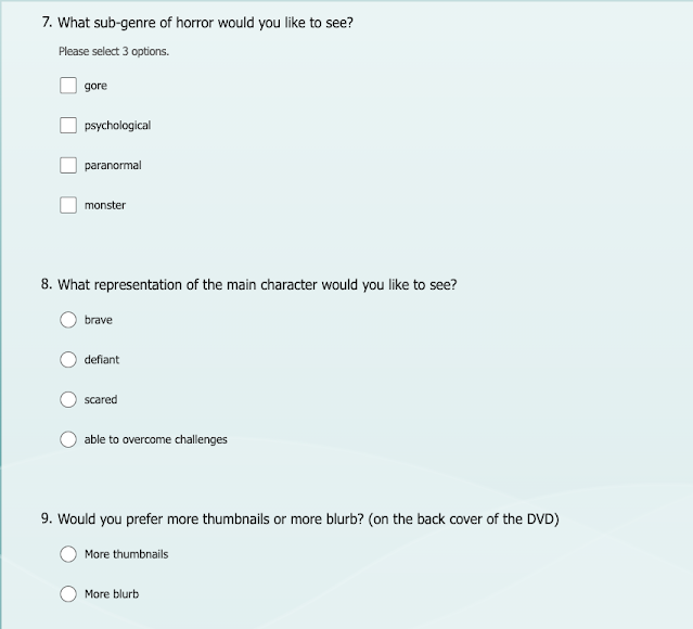
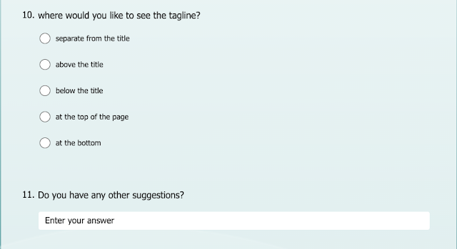
The questionnaire:
What to revise
Magazines - social context
Adverts
Film INDUSTRY
Target Audience
LO: To research our target audience to enable successful targeting.
Do Now:
Demographics are black and white facts about the person's life, such as their job, their gender and their age, whereas psychographics are more the person's interests, personality traits and hobbies.
Research Conclusion:
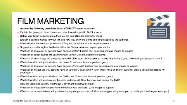
Explain the genre you have chosen and why it would appeal to 16-24 yr olds.
I have chosen the genre of horror, and this would appeal to 16-24 yr olds, because younger people are most likely to fit into the experiencers category of VALS framework, and these are the people who are thrill seekers. Horror movies provide this thrill of fear without actually putting you in dangerous situations, which is perfect when these people want the thrill, but don't want to or can't be bothered to go out and do something dangerous to get the feeling they crave. Also, for the younger part of this age range, their parents may not allow them to do dangerous things, because of their age and because it is a parents job to keep their child safe.
Define your target audience more than just the age. (Gender, interests, VALs)
Any gender can enjoy horror movies, however one gender may enjoy one horror movie more than the other. For example, a woman may enjoy a horror movie with a female protagonist or antagonist, and a man the opposite, but it is impossible to categorise this genre into genders, as anyone can enjoy horror movies. Experiencers would be most likely to enjoy horror movies, as they are thrill seekers, which is something that the horror genre provides constantly. A lot of people who would enjoy this would still be in full time education of some sort, or they may have recently left University and are at a new job. A lot of viewers of horror movies may find the real world and school fairly boring, as they may view horror movies as a way to escape the boredom, and they may have fairly protective characteristics, as this is a common theme in the protagonist of horror movies.
Explain 3 possible names for your film and how they show the genre and would appeal to the audience.
Film Storyline: follow the story of a patient who has been sent to the psychology ward and is taken care of by a certain nurse. It isn't always her, but she always feels anxious when it is this nurse that has been taken care of her. She always feels faint and hazy, and almost always has some sort of blood dripping off her arm. One day, there is a commotion out in the hall, and the electricity shuts off. She is then dragged into a constant battle of hide and seek, running from the nurse as she slowly works her way through killing her patients, with no specific method: she uses the reasons they are sent to the psych ward to kill them. Will the patient survive? Or will she perish at the hands of the nurse, who should have been locked up with her?
Psych ward - this would show the genre as it is quite mysterious and doesn't reveal too much about the film, but generally psych wards are associated with horror, especially abandoned ones. This would appeal to the audience because this title is an enigma, and they may want to find out more.
Tagline - Sometimes the one thing that is meant to cure you....
is the thing that damages you most.
The Nurse - this would show the genre because a nurse is usually someone who is thought of in a lovely, friendly way, but it would be contrasted with the main image. This also creates an enigma, as it doesn't reveal much about the character or the film.
Tagline - Whose next?
The patient - this would show the genre because it is quite an ominous title and it doesn't give much away. It would also imply there is something mentally wrong with the person rather than a physical one. This would appeal to the audience because it again is an enigma, and would make the audience think of questions such as who is the patient, why are they important etc.
Tagline - you're next.
What will your film be about (summary)? Why will this appeal to your target audience?
My film follows the story of a patient who has been sent to the psychology ward and is taken care of by a certain nurse. It isn't always her, but she always feels anxious when it is this nurse that has been taken care of her. She always feels faint and hazy, and almost always has some sort of blood dripping off her arm. One day, there is a commotion out in the hall, and the electricity shuts off. She is then dragged into a constant battle of hide and seek, running from the nurse as she slowly works her way through killing her patients, with no specific method: she uses the reasons they are sent to the psych ward to kill them (so for example if someone was sent there because they were self-harming, the nurse would stab them to death). Will the patient survive? Or will she perish at the hands of the nurse, who should have been locked up with her?
This will appeal to the target audience because it would make people ask the questions above, and want to find out the answers to them. It would also be appealing because it contains several elements, such as a game, and a vicious killer, who kills people in very creative ways.
Suggest a potential tagline that helps define the film narrative and explain your choice.
Tagline - Sometimes the one thing that is meant to cure you....
is the thing that damages you most.
I have chosen this because it juxtaposes two things, and shows how in this film you really can't trust anyone, even those who are meant to help you. It sums up the storyline quite well once you know it, but if you don't know it, it makes you ask questions about who is the one hurting the protagonist.
What sort of style are you going to have on your poster? Explain your decisions and use images to support.
I think the poster should have a very chaotic style on my poster because it shows the chaotic and terrifying storyline of the film. I want to have drawers open, maybe a drip lying on the floor, and the paper on a hospital type bed all ruffled up to show that the events that have happened there were not friendly. I want to have the protagonist looking scared, glancing over her shoulder while the antagonist is nowhere to be seen to add to the idea of hide and seek with her. I want it to have a very dark, sort of abandoned feel to it, to show that even though the games started only about half an hour ago, it has already escalated and there are barely any people left, as the nurse has fallen off the rails and killed already. I would love to be able to make the actor playing the patient have dark circles under their eyes, cuts and bruises on their arms, and one or two dead bodies lying on the floor with either gunshot or knife wounds.
An example of the colouring and dimness I would use.
An example of the grim and abandoned rooms and beds.
An example of a gunshot wound that I might replicate.
What sort of colour palette are you thinking of using? Link it to audience or genre.
A dark one, with red, black/grey and white. The white will be for the hospital gown, and will contrast the black from the under eyes and the red from the cuts. This will contribute to the genre because these are classic colours used, as red has connotations of death and danger. It also shows blood, which is a key element of horror. The black has connotations of death as well as funerals, and having this as the under eyes would show how the person is so exhausted they are close to death. It would also show how the person is tired of running. The white is typical for a horror movie, as it implies a sickness, and it would be used as the hospital gown, making it obvious to the audience.
What sort of main image are you going to have? (shot-types, mise-en-scene, subjects) Why is this a good choice for your poster and cover?
I want to have a long shot to fully show the entirety of the character and their injuries due to the antagonist of the film. I want to also be able to show the background well enough to be able to show the dead bodies and the chaos in the background. I want to show the chaos with drawers open and medical kits on the ground. The poster will have an overall dim and helpless feeling to show how the odds are against the protagonist. I think it would be good to have some fake blood on the hospital gown, to show that the protagonist has tried to help others, and I think I want to be able to replicate some injuries to show how this has not been an easy battle. These would be good choices for my poster and cover as it would allow me to clearly show the genre of the piece.
What information will you include on the poster? Link to audience appeal and genre.
- The title and the tagline: every film will include this on the poster as it explains to the audience what the film actually involves.
- The release date: this allows audiences to get excited for when the film comes out, as without it, the film may lose audience interest. It is also a classic convention of the genre and is key to the poster.
- The actors and producers names: this would allow an audience to recognise any actors or producers they may know (hypothetically), and make them want to watch the film because they recognise the actors. This is also a classic genre convention as most horror movies will display this information.
- The main image: this would allow the audience to get a snapshot into the film, and also it wouldn't be a poster without an image.
Most horror movie posters are relatively simplistic so as to not take away from the feeling that is provided by the title, tagline and main image.
What sort of style are you going to have on your DVD cover? Explain your decisions and use images to support.
The style on the DVD cover will be slightly less chaotic, and more eerie. I will still have some similar elements to ensure the cover and the poster are linked together, but I think this one will have the protagonist hiding behind a door in the background, and the antagonist featured in the centre holding a weapon, with an insane look on her face. I have chosen these ideas to make sure there is some differentiation between the poster and the DVD cover, and because I think it displays the hide and seek element of the film. It also would appeal to audiences because it creates a sense of apprehension in them, as they don't know if the protagonist will be caught or not. This also gives the audience an opportunity to be introduced to the antagonist as well, so they get a real feel for the film.
What sort of images are you going to have on your DVD back cover? (shot types, mise-en-scene, subjects) Why is this a good choice for your cover?
On the back, I will have snapshots from the film, specifically some action shots and some eerie scenes to show the humanity of the character (maybe she is crying over her best friend's body). This would work for the movie because it would give a break for the audience from just an action filled movie. There may be another shot of the antagonist hiding in the dark to show how she will not be easily caught and to show how elusive she is.
What information will you include on the DVD cover? Link to audience appeal and genre.
I will include lots of different pieces of information on the DVD cover such as:
- The age rating: This will allow the audience to know if the film is appropriate for certain people. This is a must have in all films, but specifically horror films because of the gore and the general nature of them.
- A blurb: This will clearly display the genre of the film and will also tell the audience what the film is about so they know if they want to watch it.
- Actors and producers names (on the back): This would appeal to the audience because it allows the audience to recognise people they know and make them watch the film because they like the actors/producers.
- Thumbnails/tagline/main image: Tells the audience what the film is about.
What information will you include on the spine and how will it link the cover and back of the DVD?
The age rating - this is an extremely important piece of information so it's important to have on all parts of the DVD cover. Also, if it is on a shelf, sometimes all you can see is the spine so it is important for this to be clearly displayed.
- The title - if it is on a shelf then all you will see is the spine. This would link to the cover as a whole because it shows the title, which is the whole purpose of the DVD cover.
- The production company - links the back to the spine and it helps the people know if they will like the film because if they like the company then they will probably like the movie.
How are you going to show that the DVD cover and poster are linked?
I will use the same font for the tagline on both and the same font for the title on both. I will also feature the protagonist on both, and show the same setting. This will link them together because if they have the same characters and the same setting, then it is very unlikely they would be different. I will have the same actor names and director names as well, to fully make sure they are linked.
What sort of typography will you have used throughout your products? (use images to support)
I will use a sans serif font as this is the font used on most horror movies. This also allows the audience to focus more on the design of the poster/DVD cover rather than how large/how fancy the font is. However, for the title I will use a specialist font (found on DAFONT) as this will add to the overall image of the poster/DVD cover. It will also allow me to link the two products together. This specialised font is also quite typical in horror movie posters and DVD covers as a way to add to the overall eerie feeling you gain from horror films. It would also catch the audience's eye, as the title would jump out if it was different from most other DVDs on the shelf or posters on social media/outside of cinemas.
what sort of representations will you have throughout your products? What stereotypes will you support or challenge? (Use images to support).
I will represent women in a variety of different ways, such as:
- Strong: in one of the thumbnails, the protagonist will be running, which represents her as strong as she is refusing to give in even though she is scared. Also, the protagonist will try to save someone who is dying in one of the thumbnails, showing her strength, as she has no medical training and is trying to save a woman who could still (and does) die.
- Scared: in a few scenes, I will support the stereotype of women being scared, but this is to allow me to show the protagonist is human, and isn't perfectly fine all the time, especially when she is being chased by someone who is not mentally stable.
- Insane: the antagonist is a woman who is extremely unstable, and tries to kill everyone in her sights.
Men are also represented, but more subtly, only appearing in one or two thumbnails:
- In the thumbnail that a man is in, he will be represented as peaceful, kind an scared, as he is dying in this scene.
Wednesday 12th June 2024
NEA Planning
LO: To plan an effective product aimed at a specific audience using appropriate codes and conventions.
Friday 28th June 2024
NEA Create!
LO: To create an effective product aimed at a specific audience using appropriate codes & conventions.
Wednesday 3rd July 2024
Friday 5th July 2024
Possible titles:
Tuesday 10th September 2024
Coursework Review & Plan of Attack!
LO: To review work so far and create a detailed plan.
Plan:
Friday 13th September - set up template for poster, DVD cover (including spine). If there's time, begin editing and choosing the photos.
Tuesday 17th September - Continue editing and choosing photos, find a billing block and decide on a release date.
Friday 20th September - Continue editing, if finished, add image to poster template.
Tuesday 24th September - Continue editing, if finished, add images to DVD cover and spine.
Friday 27th September - Continue editing, if finished, choose title design and add all text and pictures to poster and DVD cover (title, tagline, age rating etc)
Tuesday 1st October - Continue to find and add text and pictures to poster and DVD cover, edit any if needed.
Friday 4th October - Plan for the spine, write out title, get age rating and production logo to add.
Tuesday 8th October - Edit anything that needs it, add the images to the spine.
Friday 11th October - CHECK! THERE WILL BE MISTAKES!!!
Tuesday 14th October - CHECK!! There will be things to do!!
Friday 17th October - Deadline! Check everything, there might still be mistakes!!
IF EDITING IS NOT FINISHED BY THE END OF SEPTEMBER, MOVE EVERYTHING UP ONE. IF IT IS STILL NOT COMPLETED AFTER TUESDAY 1ST OCTOBER, COME IN AFTER SCHOOL TO ALLOW YOURSELF TWO LESSONS OF EXTENSIVE CHECKING!!!
Friday 13th September 2024
Do Now:
1) The target audience for my brief is 16 - 24 year olds.
2) I have to produce a horror movie poster and DVD cover (including spine). I need at least seven photos for the DVD cover (main image, four thumbnails, back main image and an additional image) and one for the DVD poster. One of the pictures on the DVD cover has to be in a different location to the others.
3) I'm going to include a colour palette that is suitable for the genre and the target audience's enjoyment (red, white and black), a gory main image, and a snapshot of a chase.
Tuesday 17th September 2024
NEA Create
LO: To create an effective product aimed at a specific audience using appropriate codes & conventions.
Do Now:
1) Raheem Sterling is a footballer who faced discrimination, and now not only has continued his football career but also fights against discrimination in football. He is the cover star of our GQ set text magazine.
2) Malala is known for standing up for women's rights. In her home country, the Taliban denied all girls the right to education. Malala stood up against this, and while on her school bus was shot in the head by the Taliban. She miraculously survived, and now she fights for women's rights to education.
3) GQ stands for Gentlemen's Quarterly.
4)Vogue is a fashion magazine.
5) A magazine masthead is the title of the magazine. Shown in a specific style.
Friday 20th September 2024
NEA Create!
LO: To create an effective product aimed at a specific audience using appropriate codes and conventions.
Do Now:
1) Malala was an unusual choice for a vogue cover because previously there had been little to no diversity on their magazine cover: Malala was an anti stereotypical cover star for Vogue. Vogue is a fashion magazine and Malala isn't a stereotypical model or celebrity.
2) The target audience for GQ is: male, educated and upper class/interested in fashion. 20-44. ABC1 men. Alpha males.
3) The target audience for Vogue is: female, early 20s-mid 40s (45) and interested in fashion. ABC1 females.
4) Anchorage is the use of words to give meanings to images, such as captions, headlines, and taglines.
5) A main cover line is the largest cover line on the magazine cover, and is designed to capture the reader's attention. It will also explain the largest topic of the magazine. Links to the main image.
Poster Checklist:
Main image - Done
Tagline - Done
Clear branding and original title - Done
Release date - Done
Billing block - Done
Production company logo - Done
DVD Front Cover Checklist:
Main image - Done
Clear branding and original title - Done - Straighten up title
Names of actors and director - Done
Appropriate production and age certification logos - Done
DVD Spine Checklist:
Film title -
Appropriate production and age certification logos -
DVD Back Cover Checklist:
Main image -
Four thumbnail images -
Promotional blurb including references to the narrative and establishing the genre -
Billing/Credit block -
Production and age certification logo and technical information -
DVD Blurb:
17-year-old Sarah Bloom (Lauren Jessep) has been living on the psychology ward for just over a month and is beginning to settle into the routines of everyday life. She has even made a friend, 19-year-old Jake Samuels (George Partridge). But when a new nurse is transferred to her block, Sarah can't shake the feeling that something is off about her. Nurse Freya (Jasmine Warren) seems perfectly normal on the outside, but has strange obsessions that you would only pick up on if you were a patient of hers, like her fascination with blood, or the way she always pays a little too much attention to everyone's files. But one day, a commotion can be heard in the corridor, and when the patients go to investigate, they're greeted by a terrifying sight. Suddenly, the one place that was meant to be a sanctuary turns into hell...
Friday 27th September 2024
Do Now:
1) B is a serif font.
2) If asked about lexis, you should look for specific word choices.
3) Typography includes the font that has been used and the size of it. Font colour.
4) 3 things included in mis-en-scene: the facial expressions, the props and the costumes.
5) CGI and colour grading are included under colour palette. Editing.
Tuesday 1st October 2024
Do Now:
1) A is a sans serif font.
2) The slogan on the This Girl Can advert is "Sweating like a pig, feeling like a fox".
3) Ideology includes a brand's main goal for their product. Beliefs, attitudes and values.
4) Intertextuality is when adverts/authors take ideas from other products to put into theirs. The referencing of one text in another.
5) The age rating for No Time To Die is a 12.
Film Poster:
Friday 4th October 2024
Do Now:
1) Typography includes the font used, the size and the colour.
2) No Time To Die was released in 2021.
3) The Man With The Golden Gun poster included a reference to the nuclear power stations and the dangers they included, as this was a big thing in film at the time. Kung Fu
4) Intertextuality is taking ideas/information from other products and using it in your own product without actually copying it.
5) The women on the No Time To Die poster are represented both as the stereotypical "Bond girl", but also as strong and powerful as there is one woman holding a gun and wearing some professional body armour. The stereotypical "Bond girls" are represented in this way as they are wearing low cut long evening dresses. Sexually objectified.
Tuesday 8th October 2024
Do Now:
1) Rodger Moore played James Bond in The Man With The Golden Gun.
2) The Man With The Golden Gun was released in 1974.
3) The Man With The Golden Gun poster referenced the recent nuclear power station disasters and the dangers they held. Global energy crisis.
4) Daniel Craig played James Bond in No Time To Die.
5) Women on the Man With The Golden Gun poster are represented as helpless, damsels in distress and are sexually objectified. Stereotypical Bond girls.
Tuesday 15th October 2024
Do Now:
1) Metro-Goldwyn-Mayer produced No Time To Die. Eon Productions.
2) No Time To Die was distributed by Universal Pictures.
3) The film industry process: Production, Distribution, Exhibition.
4) Marketing comes under the distribution category.
5) Three examples of typical film marketing products: posters, merchandise and websites. trailers, billboards, teasers.
Friday 29th November 2024
Coursework Improvements
LO: To apply required brief elements in order to improve coursework.
Do Now:
1) Coursework is worth 30% of the GCSE grade.
2) You have to include a minimum of eight images.
3) Typical characteristics particular to a specific genre are known as genre conventions.
4) The deadline for NEA draft 2 is Christmas. January 6th 2025
5) No.
Friday 25th April 2025
Do Now:
1) The target audience for my brief is 16-24 year-olds.
2) I had to produce a film poster, DVD cover, DVD back cover and spine for a horror movie.
3) To appeal to my target audience I didn't include too much gore, I had an age rating of 15 and I used a dark colour scheme.




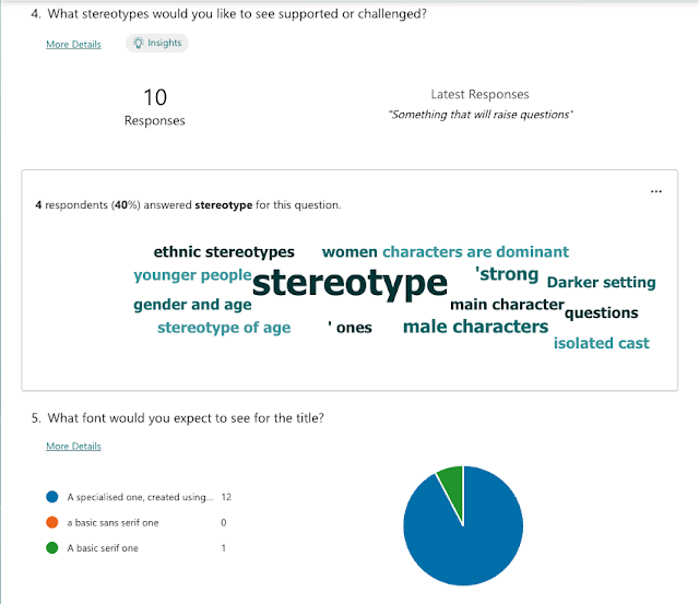


Not sure where my previous comments have gone?!
ReplyDeleteYour research and planning is excellent. Detailed and thorough - you have clearly applied your research to your planning.
TARGET AUDIENCE PROFILE: excellent
PLANNING DOCUMENT: great ideas - I cannot wait to see this!